|
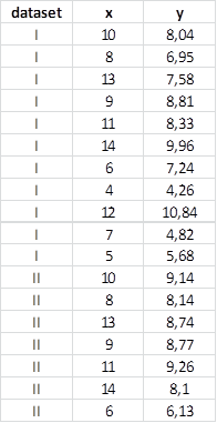
Typically, code to create a seaborn chart looks like this (it's a procedure that uses an example already built into the library). Here is part of the data table:
Python code using Seaborn:
#Déclaration of the library
import seaborn as sns
#Choix the back color
sns.set_theme(style="ticks") chart
#Chargement an example base
df = sns.load_dataset("anscombe")
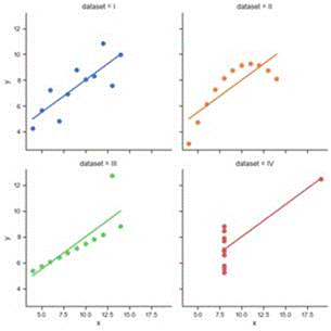
#Graphique for linear regression.
sns.lmplot( data=df, x="x", y="y", col="dataset", hue="dataset", col_wrap=2, palette="muted", ci=None, height=4, scatter_kws={"s": 50, "alpha": 1} )
|

 Seaborn Code Explained